I love converting large datasets to a more accessible form through visualisation. This democratises information in an increasingly data-saturated age.
Complex spreadsheets can be difficult to understand. Presenting such data in an easy-to-read manner, whether it’s through maps, infographics or other visually appealing forms leads to improved informational access and inclusivity.
NFU Mutual approached me to produce a set of four UK maps, showing a planned consolidation of agent locations and catchment areas over a four year period. I used a complex spreadsheet for reference, and boundaries were an approximation based on several criteria.
Later I was asked to produce a single map detailing the up-to-date catchment areas at the completion of this process. The boundaries of the new map, based on postcodes, had to be more precise. I used Microsoft MapPoint screenshots provided by the client to provide an initial boundary guide and catchments. I then spherically mapped the screenshots into a single map of the UK and used Adobe Illustrator for the resulting trace.
The whole set of maps was then printed to a large format, with the text details layered onto acetate for ease of presentation.
I have no hesitation recommending Anthony, he is a pleasure to deal with, switched on and energised, with a real eye for detail coupled with exceptional creative flair.
His output is always high quality, he grasps our requirements easily and provides highly useable business materials, quickly and with no fuss. When I need materials of this nature, he is my go-to man for the job!


The full map for agent locations and catchment areas. Press Ctrl+ and Ctrl- to zoom in and out if on a desktop browser.

The previous set of four consolidation maps running from 2015 - 2018, showing a merging and consolidation of key areas.
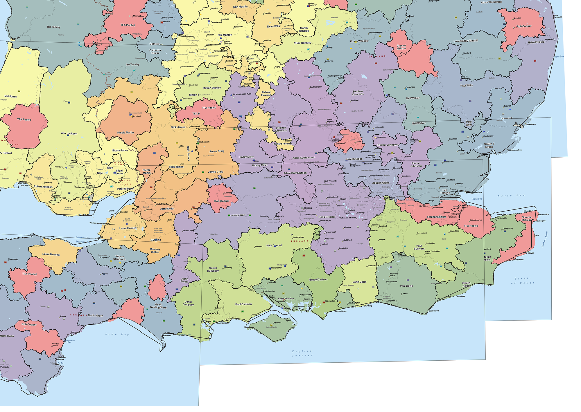
24 Microsoft MapPoint screenshots were composited over a UK map template for the initial trace. As MapPoint maps to a sphere the main challenge was ensuring that the edges lined up to the correct proportional scale.

I then added locations, agents and a regional colour scheme to the resulting trace. The map aims to incorporate a significant amount of detail whilst maintaining clarity.